Iconography Design / TTEC Digital
Building an Icon System from Scratch.
Role.
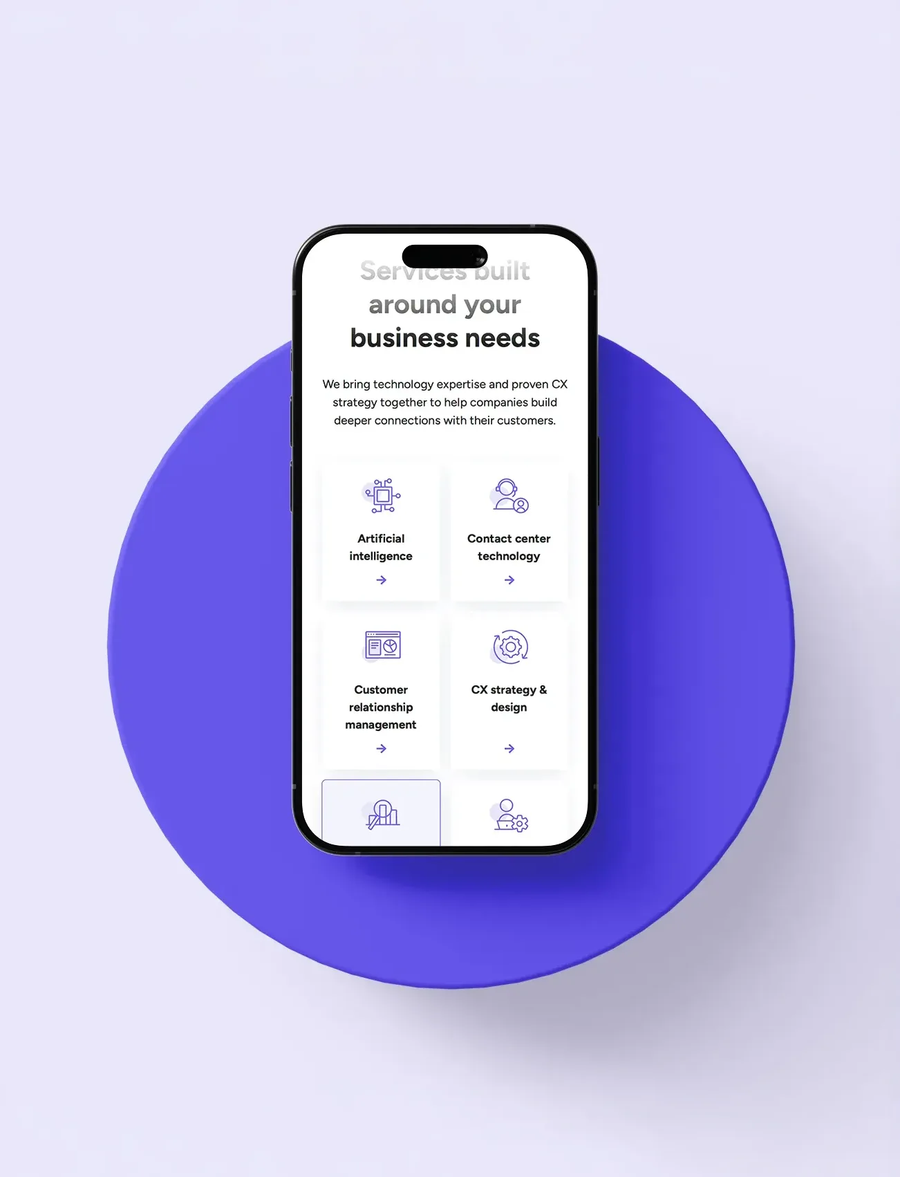
Services.
System Design
Tools.
Deliverables.
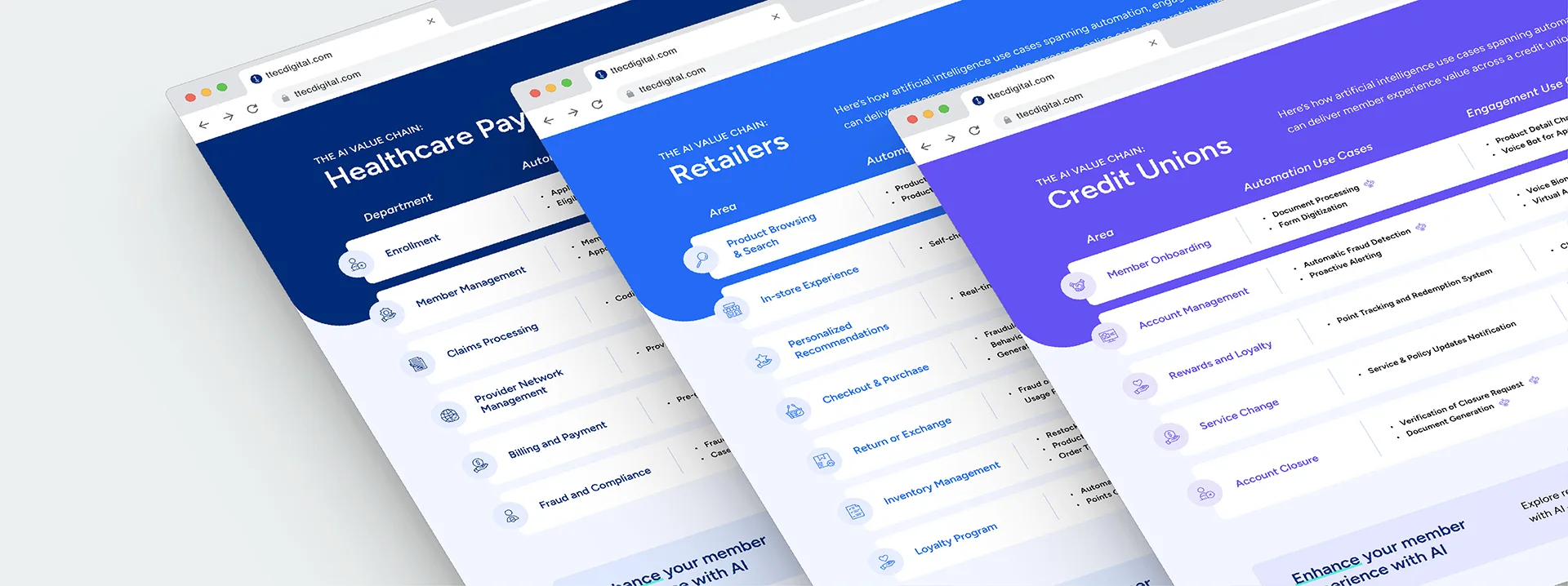
Problem —
No official icon set meant every team solved the problem differently. The result was a brand that looked inconsistent everywhere it showed up.
Approach —
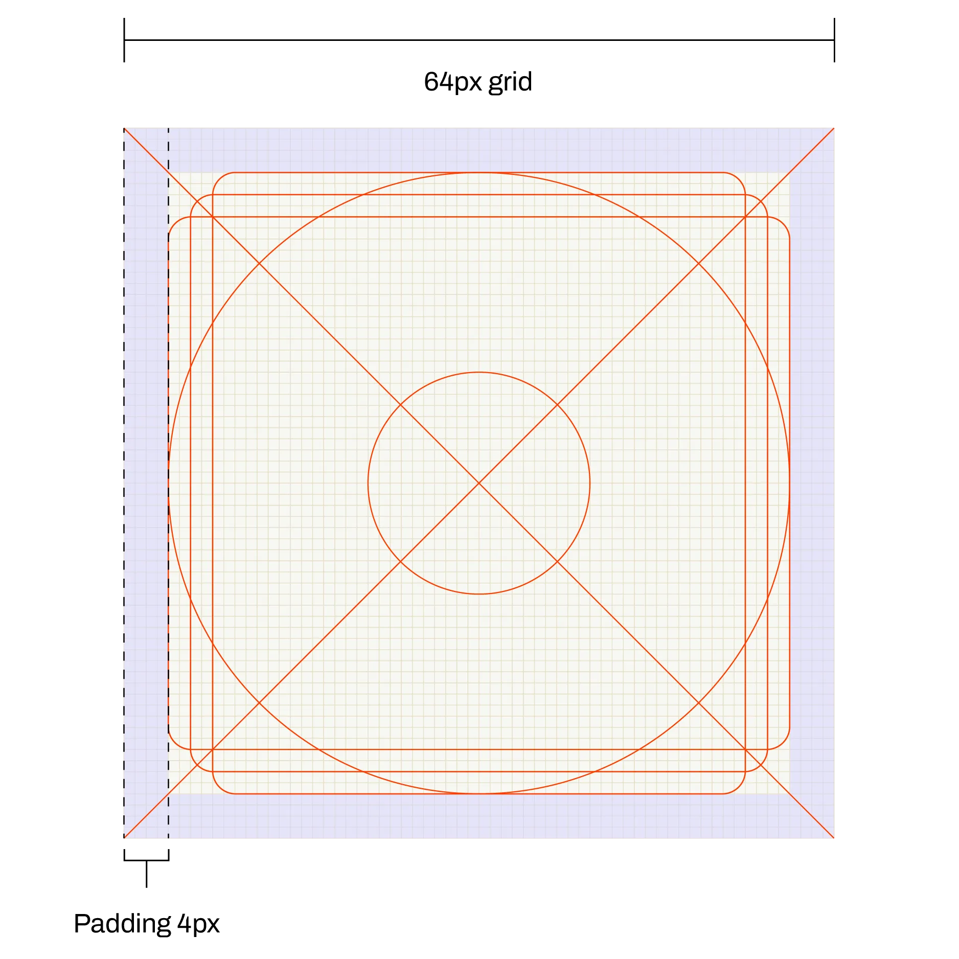
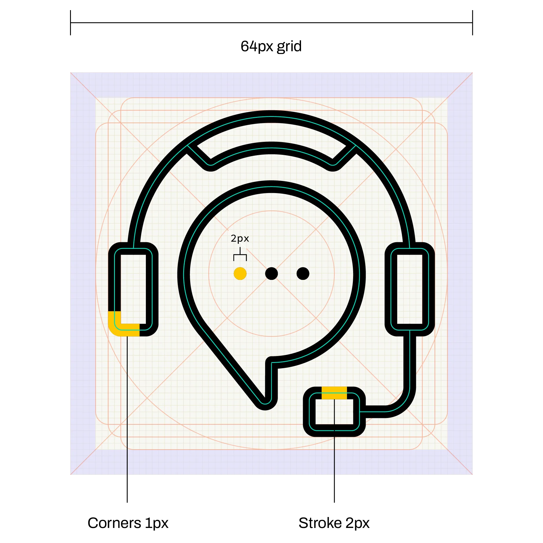
The construction grid is what makes the system sustainable; icons get built as needs come up, not all at once, and everything stays consistent because the rules don't change.
Outcomes —
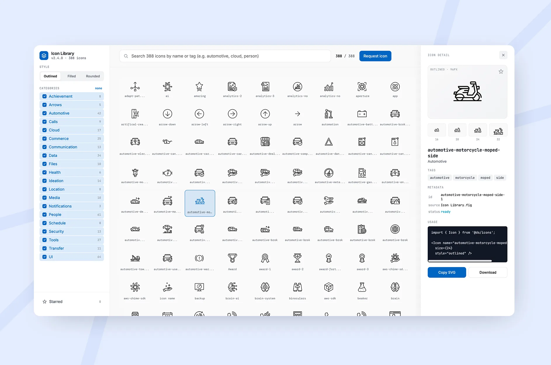
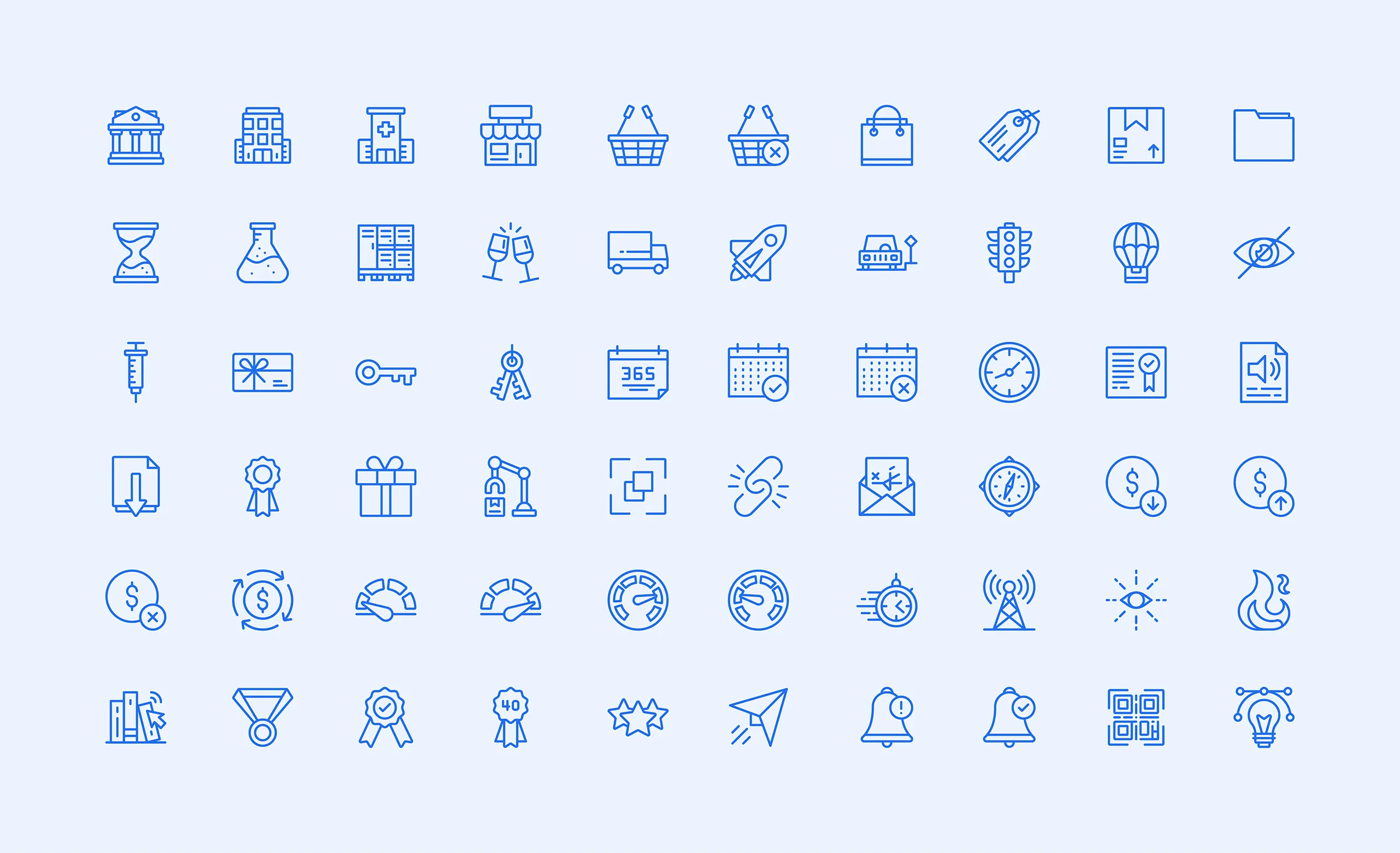
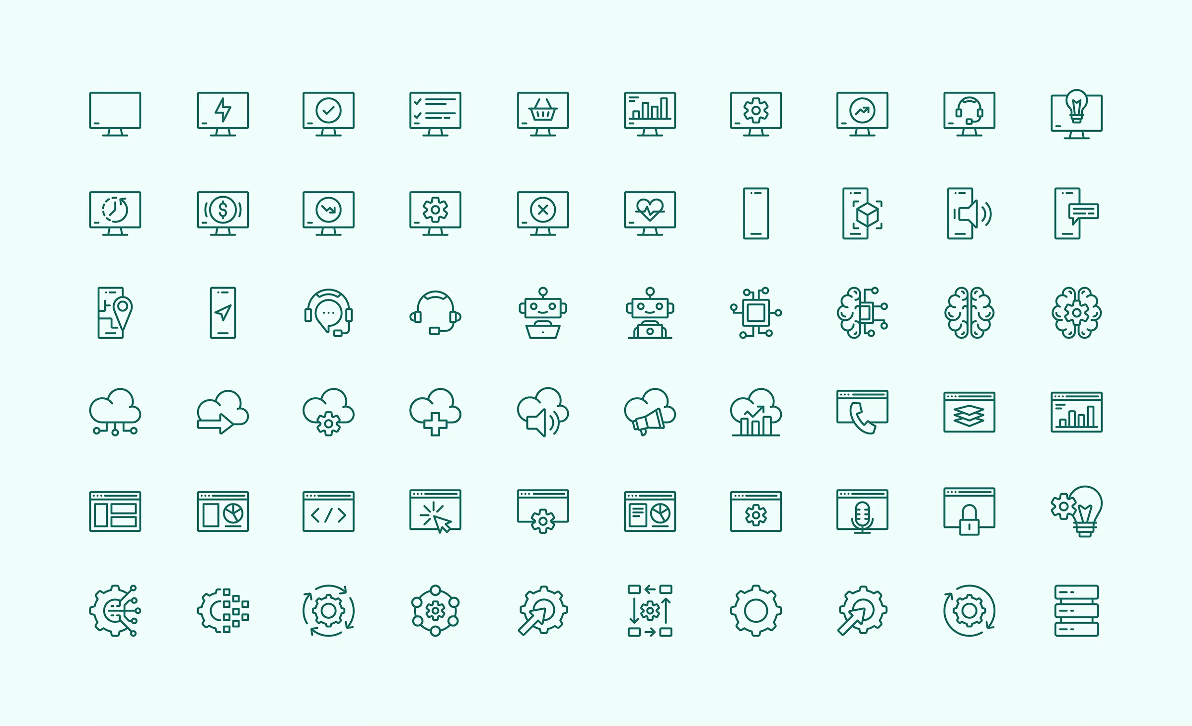
300+ icons later, it's made a real difference in consistency across the board. The library is still actively growing.
How I built it.
The construction grid came first: 64px base, 4px padding, 2px stroke, 1px corner radius. That decision made everything else possible. New icons could be added at any point without losing consistency with the ones already in the library.
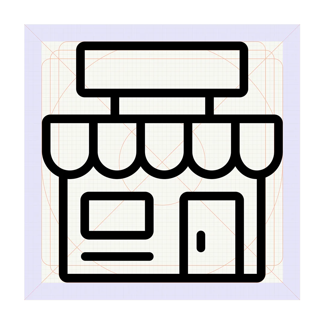
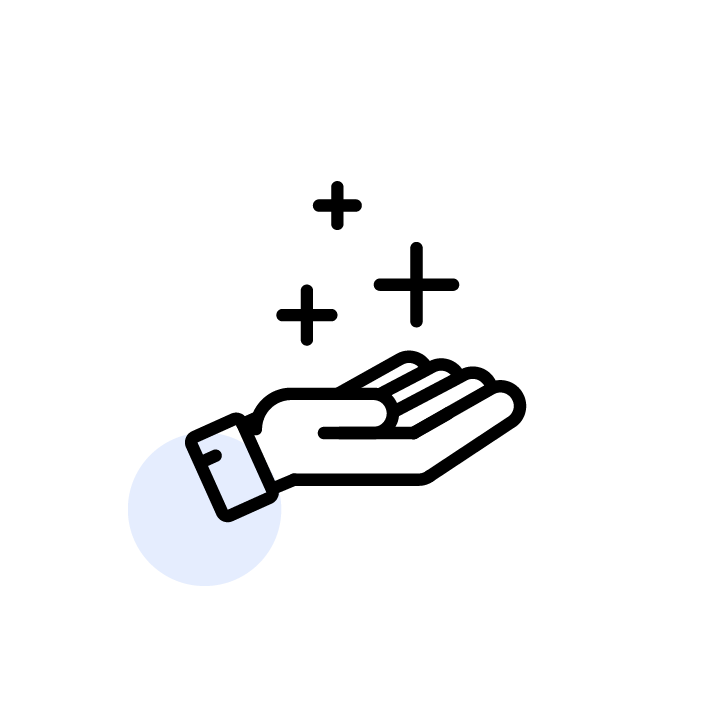
Each icon was designed to work across multiple color applications, black and white, primary blue, secondary blue, teal, purple, and highlight variants, so the same icon could flex across different contexts without being redrawn.

