Brand & Web Design / Novo Mental Health
Building a Mental Health Brand Centered on Renewal and Transformation.
Role.
Web design & implementation
Services.
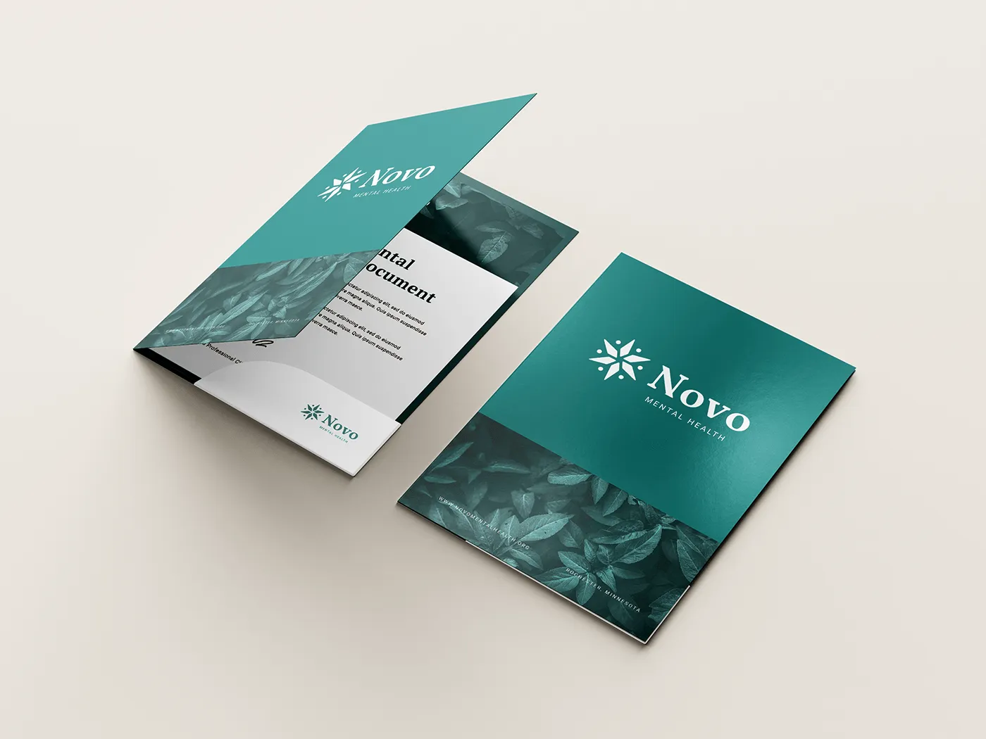
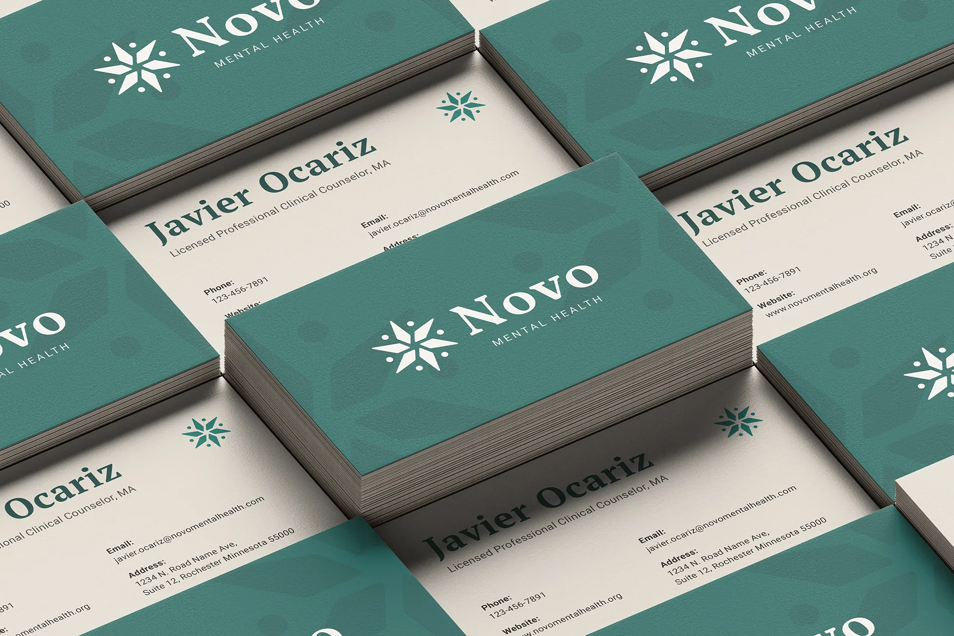
Brand identity
Website design
Squarespace implementation
Tools.
Adobe Photoshop
Figma, Squarespace
Canva
Challenge —
Novo Mental Health needed to launch in 3.5 months with no existing brand, website, or visual identity. Most counseling websites are hard to navigate, overwhelming with information, and lack clear calls to action. The client needed a brand and website that would establish credibility quickly while making it easy for potential clients to find support.
Approach —
I created a brand identity centered on a lily-inspired logo representing renewal, healing, and integration of self through therapy. The Squarespace website prioritized clear navigation and accessible calls to action, with custom code pushing beyond standard templates. The result was a distinct, professional experience that remained simple for the client to maintain.
Outcome —
Novo Mental Health launched on time within the 3.5-month timeline. Over a year later, the site ranks on the first page of Google for branded search — without any paid advertising behind it. The client maintains the site independently, which was a core goal from the start.
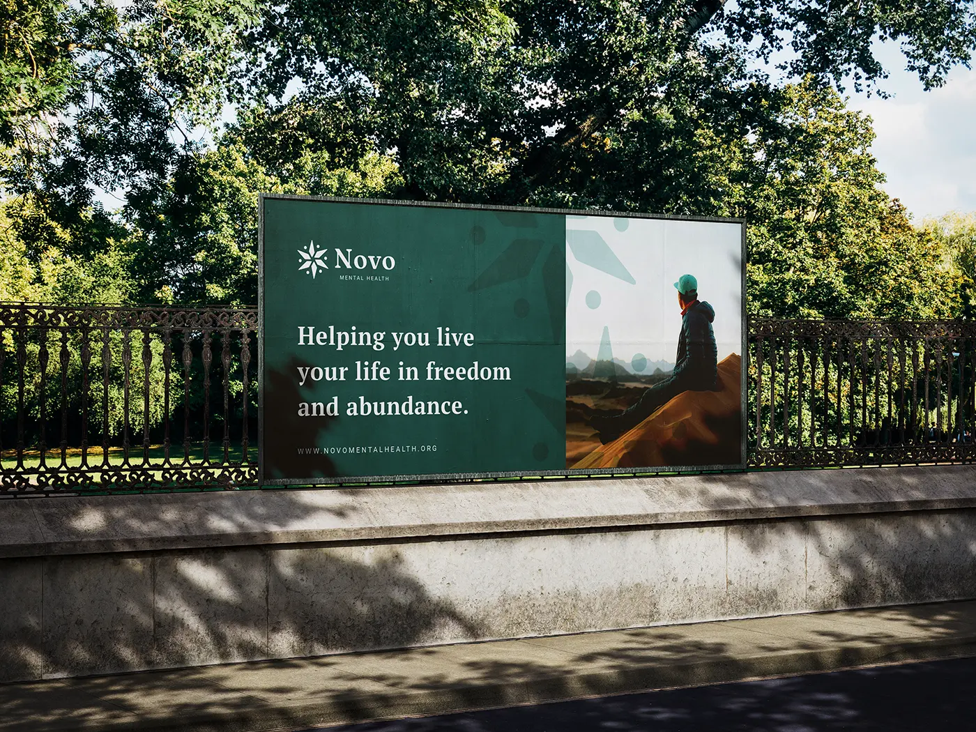
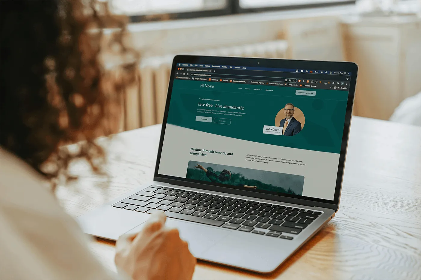
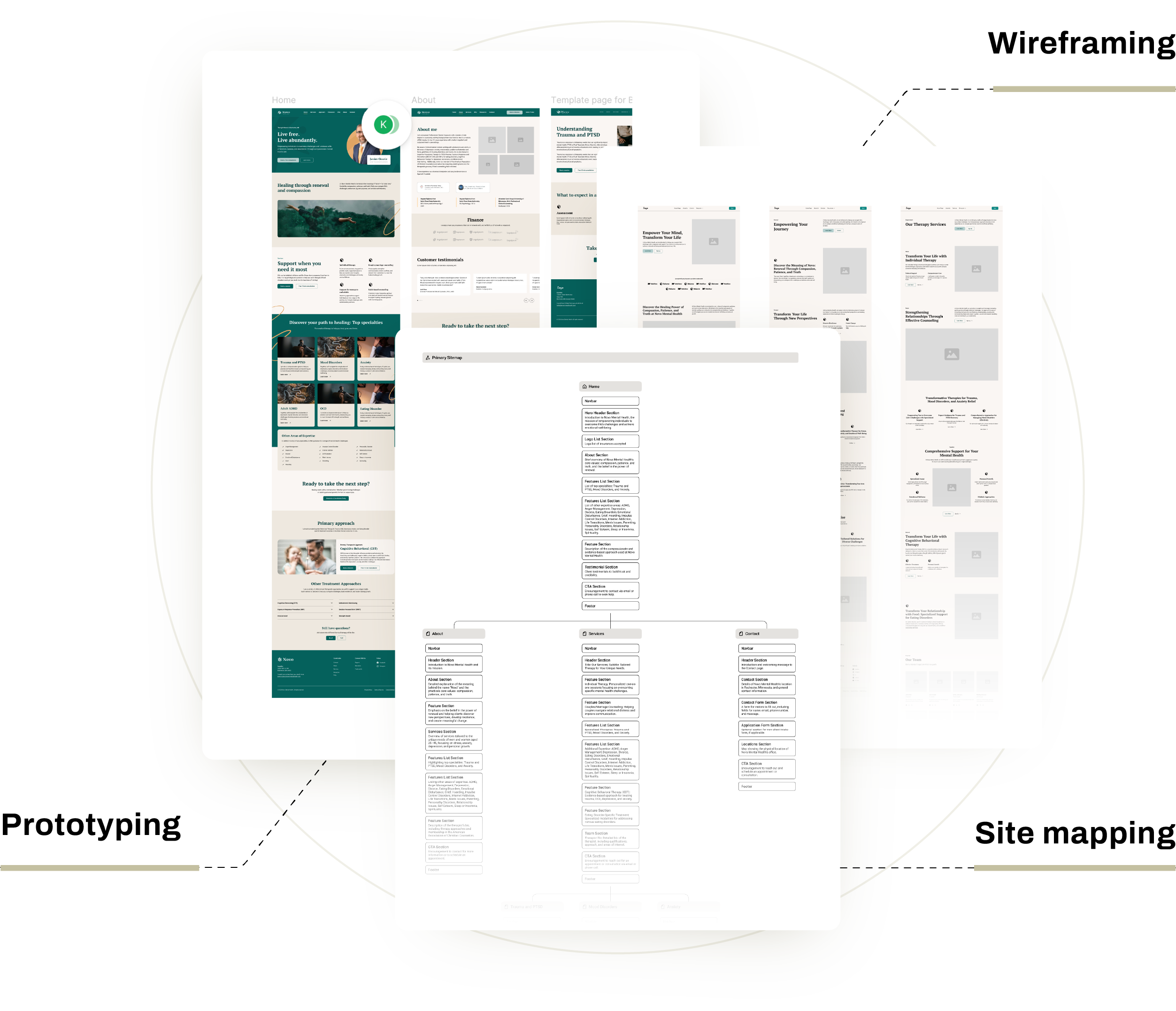
The website.
The website needed to stand out from generic mental health sites while remaining easy for the client to maintain.
I started with site mapping, wireframing, and prototyping to establish clear hierarchy and user flows. From there, I built the site on Squarespace for maintainability, but used custom code to push beyond the standard templates. Most therapist websites on Squarespace feel identical. I wanted this to feel distinct.
Custom code allowed me to create a unique hero section, custom navigation, and intentional layouts for service pages. I designed custom icons that appear throughout the site to reinforce the brand's warmth and guide visitors through content.
The structure prioritizes clarity. Visitors can quickly understand services and find what they need. Critical actions like contacting or scheduling are accessible from multiple touchpoints.


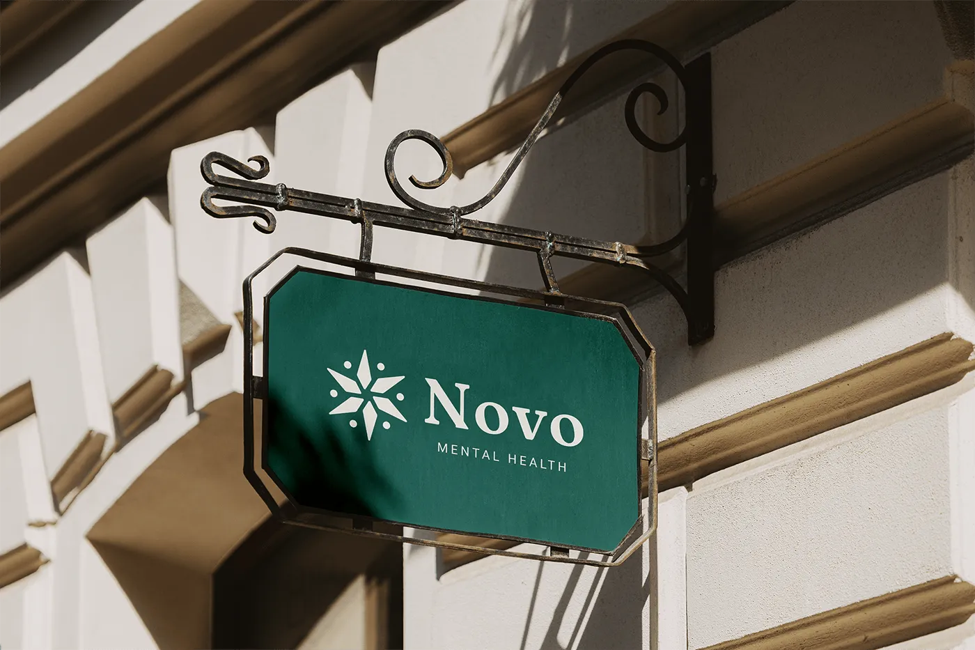
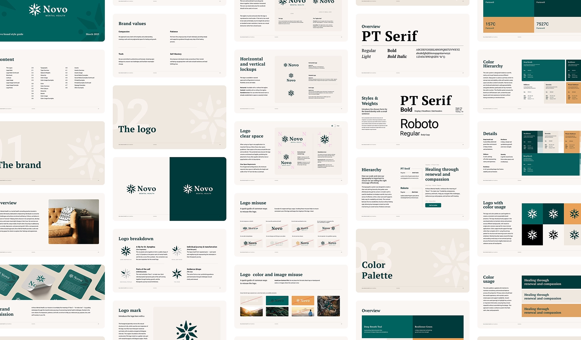
Building the brand.
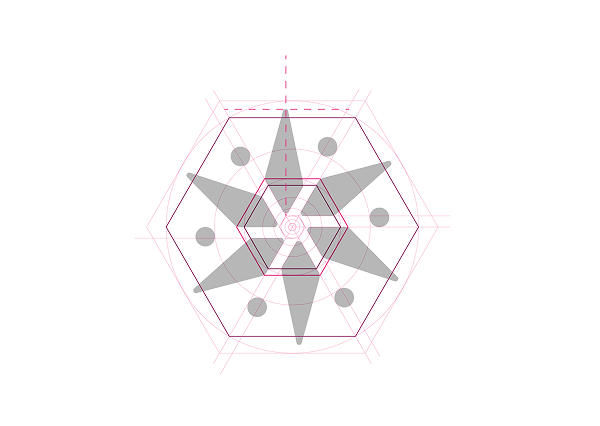
Icon logo build —
The hexagonal geometry mirrors the natural structure of a lily, which was the core inspiration of the logo. True lilies have three-part rotational symmetry with six petals arranged at 60-degree intervals. This organic foundation informed the construction.
The logo is built on a golden ratio grid with nested hexagons at 60-degree angles. Petals align to hexagonal intersections, rounded corners are derived from divided hexagonal spacing, and dots position on the third golden circle — every element traces back to both the lily's natural form and precise mathematical relationships.
Symbolism —
(Core inspiration)
The six petals come together to form a subtle shape of a lily. St. Dymphna is the patron saint of mental health, and the lily is one of her symbols — this connection was the core inspiration for the overall logo.

(Individual petals)
The mark embodies "Novo" — to make new. Each individual petal represents parts of the self coming together through healing, growth, and the therapeutic journey toward wholeness.
(Petal-Dot pairs)
The logo is built from repeated pairs — each petal and neighboring dot representing the individuals in their therapeutic journey.
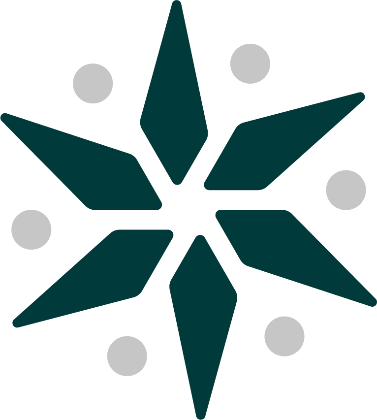
(The star)
The center forms a star, symbolizing guidance and illumination through challenges toward clarity and renewal.
Color —
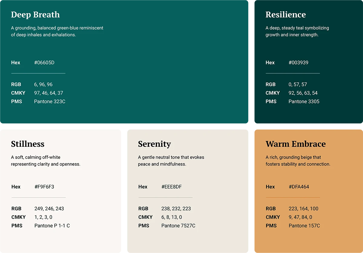
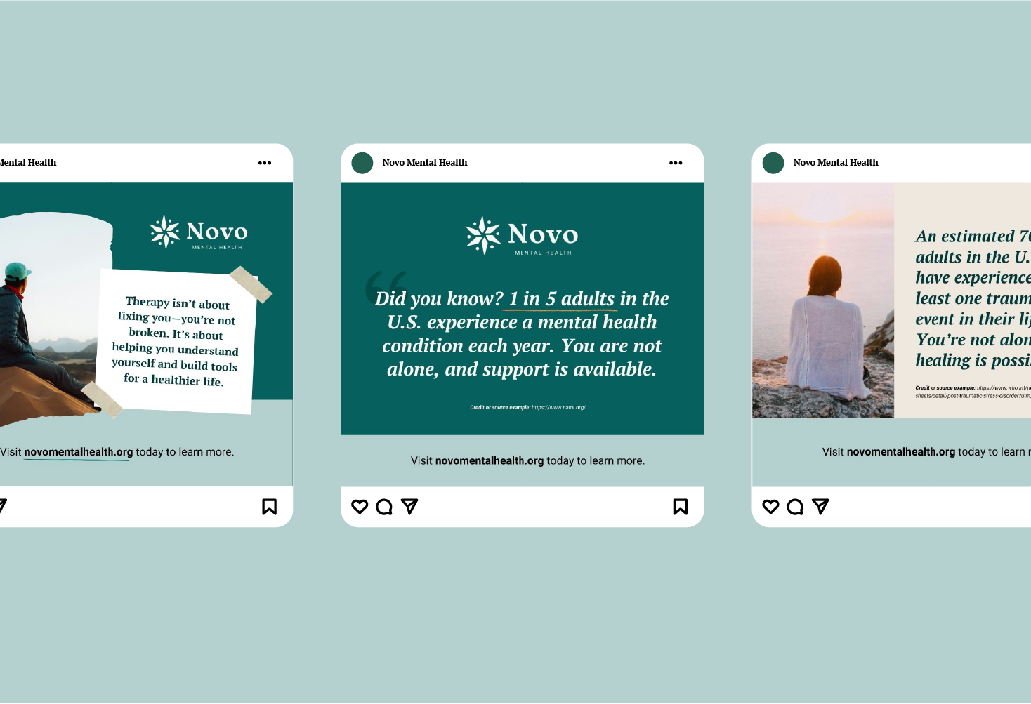
Through color exploration with the client, I tested multiple directions built around greens and warm neutrals. The goal was balancing emotional safety with professional credibility, calming enough to feel approachable, grounded enough to build trust. The final system handles educational content, sensitive topics, and clear calls to action without feeling cold or clinical.
Primary Colors: A rich teal green with a darker contrasting green and soft ivory convey calmness and trust while symbolizing growth and renewal.
Supporting Colors: A warm coral highlight brings energy without overwhelming the calmer palette.
Typography —
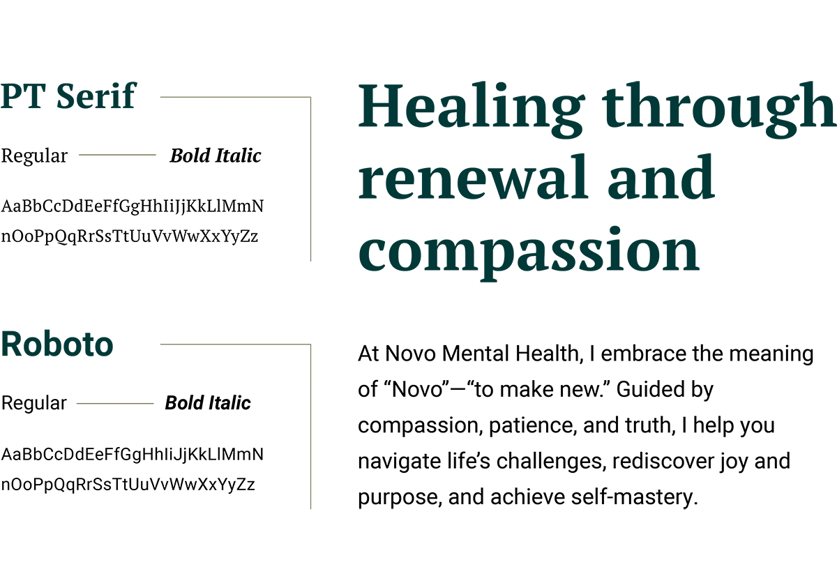
PT Serif and Roboto strike a balance between warmth and clarity. PT Serif brings traditional credibility to headings with a slightly modern edge — trustworthy without feeling clinical. Roboto keeps body copy open and readable, even in longer sections. Both fonts prioritize legibility and accessibility, ensuring information is immediately clear for people seeking support.
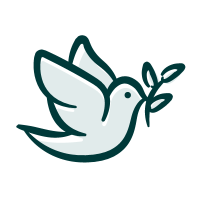
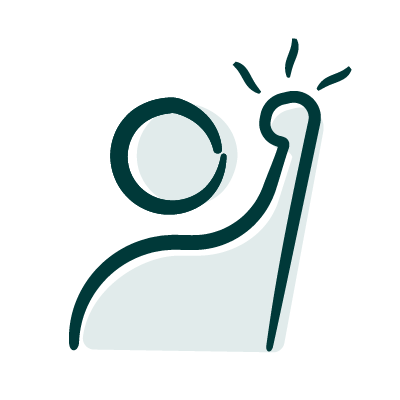
Custom icons —
Lastly, I designed a set of custom icons to bring warmth and humanity to the brand. They appear throughout the website to reinforce key services and guide visitors through content without relying on stock imagery.