Web Design / TTEC Digital
Designing and Building ttecdigital.com
I've been part of that work since the beginning; first as a supporting designer, then as the only designer, then as the lead designer shaping the visual direction. Today I design, build, and maintain the site directly.
Role.
Tools.
Timeline.
ThE Begining
Three brands to one site —
TTEC acquired Avtex and VoiceFoundry in 2021, with plans to gradually sunset both brands and merge them into a new subbrand: TTEC Digital. I worked under the creative director and web lead on imagery and card templates for the family-brand site that launched in 2022.
At the end of 2022 into early 2023, the creative director and web lead both moved on from the company. I became the only designer on the team which gave me room to shape both the site and the visual brand from the ground up.
2026
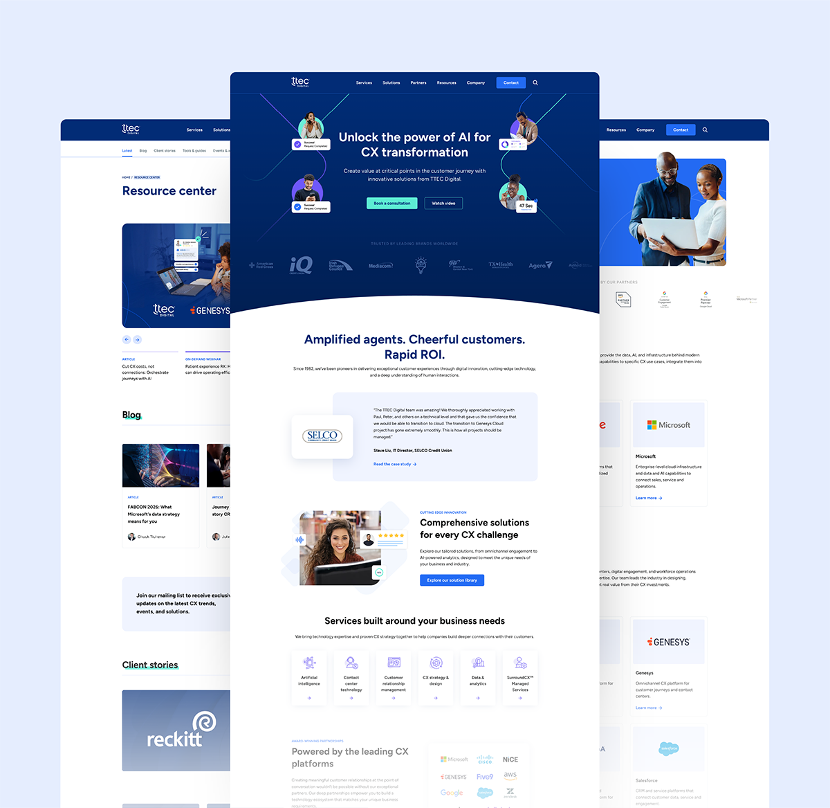
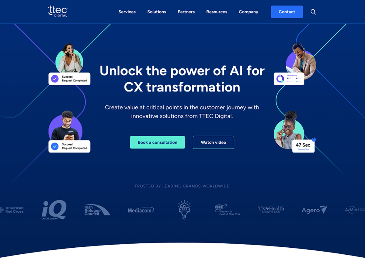
The site today —
The site today is the result of a few years of layered work — a brand built from scratch, navigation mapped from the site structure up, redesigned core pages, and a move to Webflow that put the build directly in my hands. Below are a few of the pages I design and maintain across the site.
The history & the process
A look into the web design process —
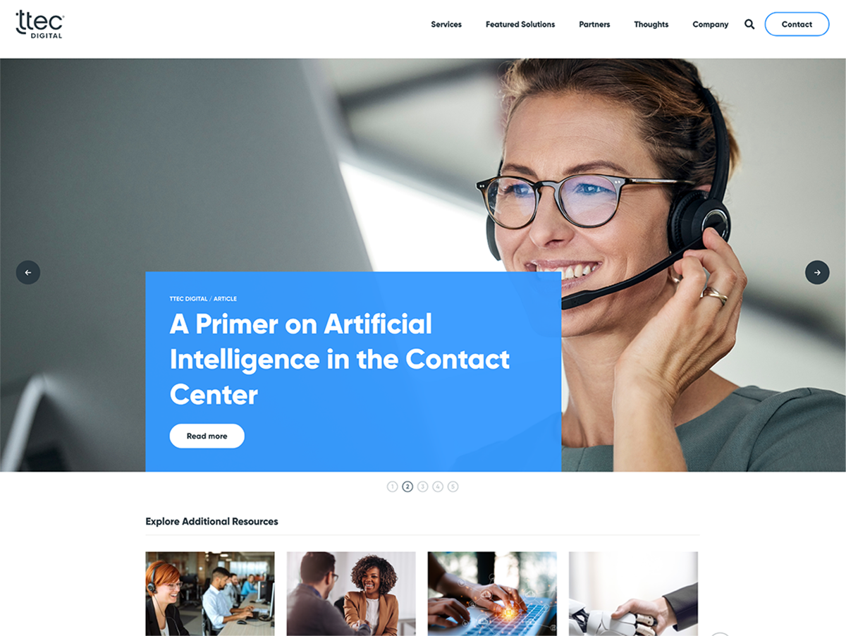
By early 2023 the three brands had merged into one. But TTEC Digital existed as a name without a brand — colors borrowed from the parent and the two sunset brands, a site that read more like a blog than a B2B business. Navigation was flat: click a link, land on a page, dig from there.
I worked alongside someone from digital and demand gen to start fixing it. She moved on from TTEC Digital in April 2023, and the visual overhaul came down to me.
Early – Mid 2023
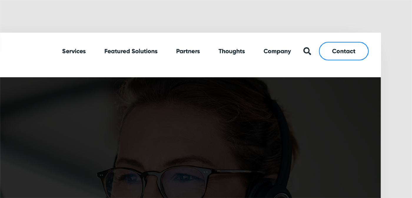
Mapping the navigation —
The old navigation was a flat list of links — no dropdowns, no way to scan what the company offered easily. The team and I mapped the full site structure first, decided what belonged in the nav and what didn't, and I designed a mega menu that surfaced solutions, industries, resources, and company info at the top level.
Early – Mid 2023
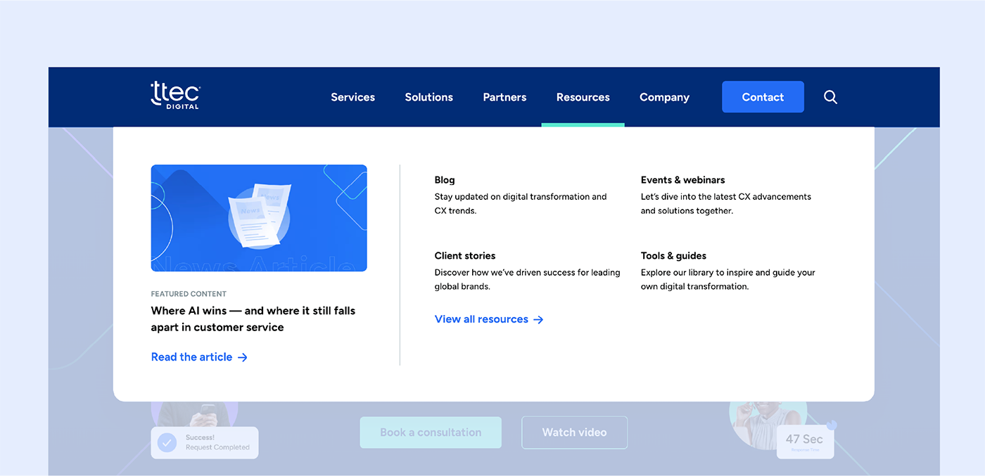
Resource hub redesign —
The resource hub, originally called "Thoughts," was a long list that mixed blog posts, case studies, events, and gated content all competing for attention on the same page. I restructured it around filterable content types so users could find what they needed without scrolling through everything else. The new Resource Center surfaces the latest blogs, client stories, resources, news, and events on the landing page, with sub-navigation and section CTAs that route users into each content type's dedicated page. Cleaner on the front end, cleaner on the back end.
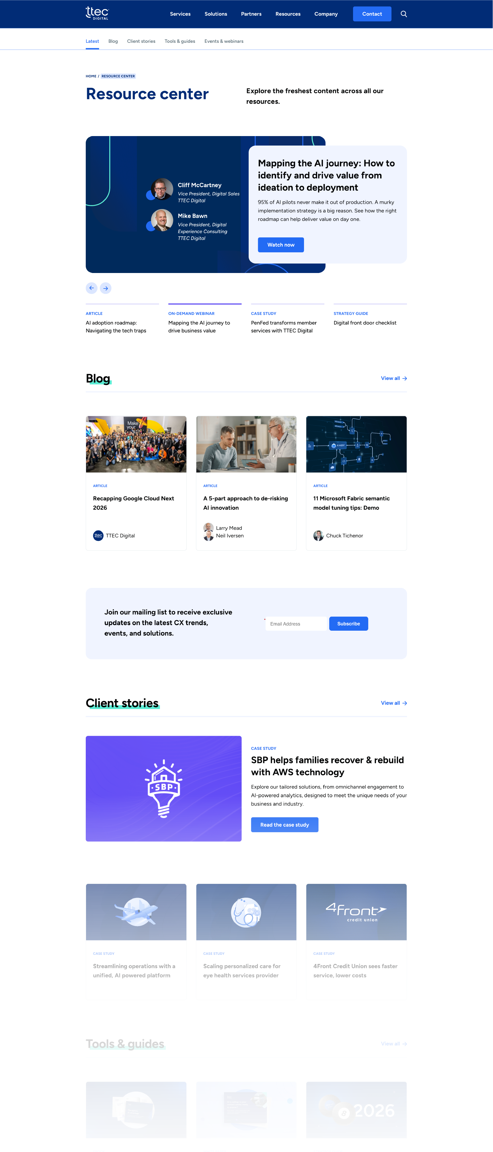
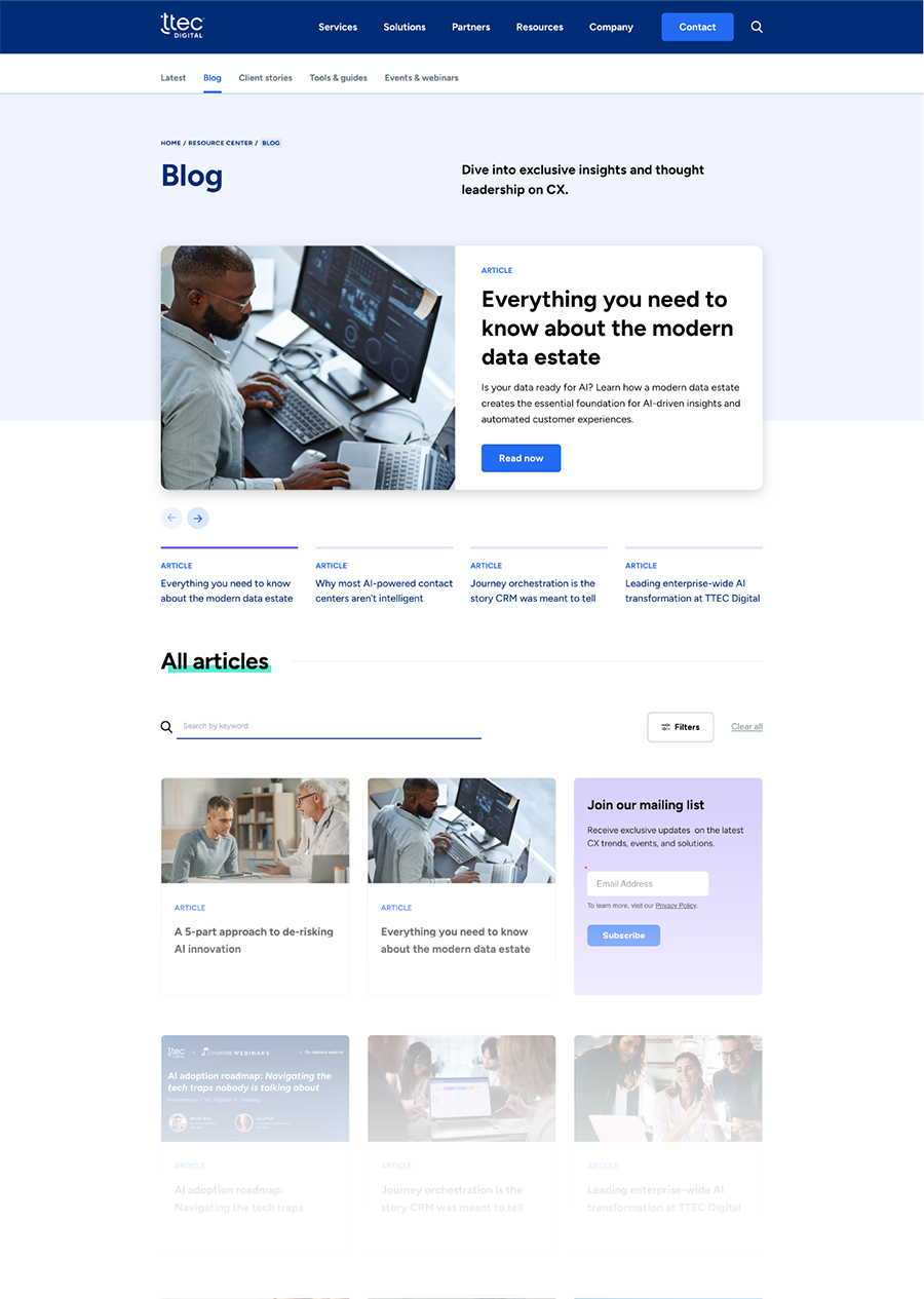
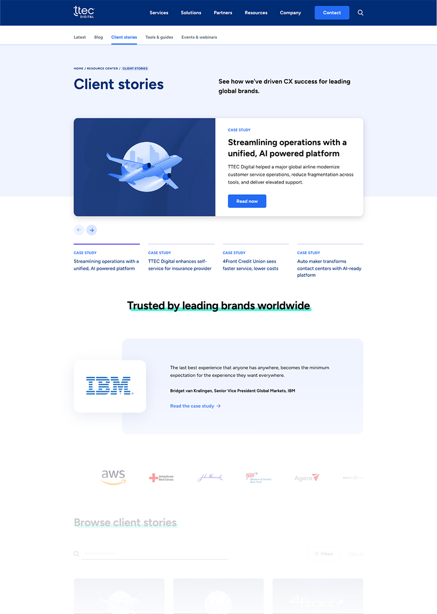
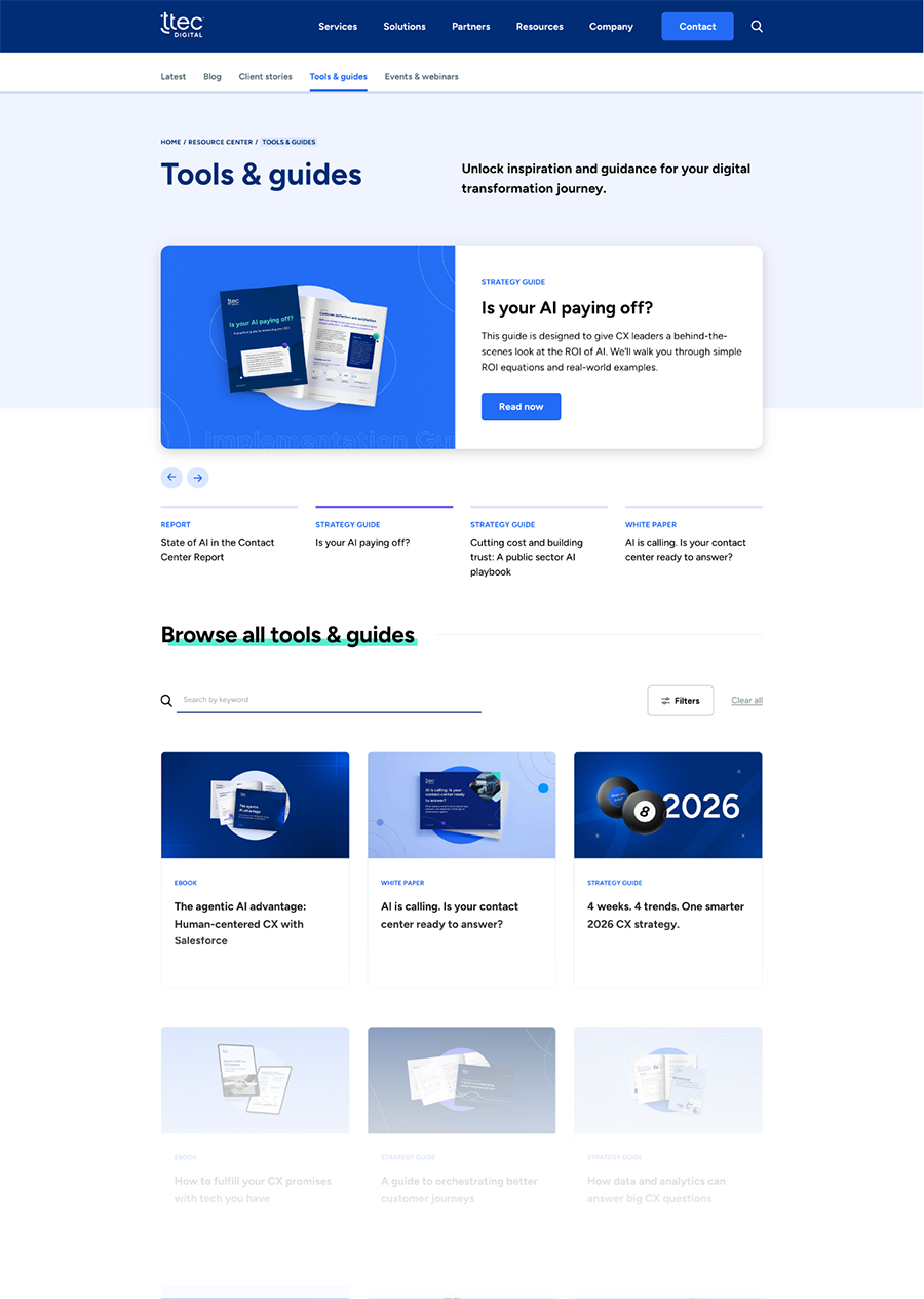
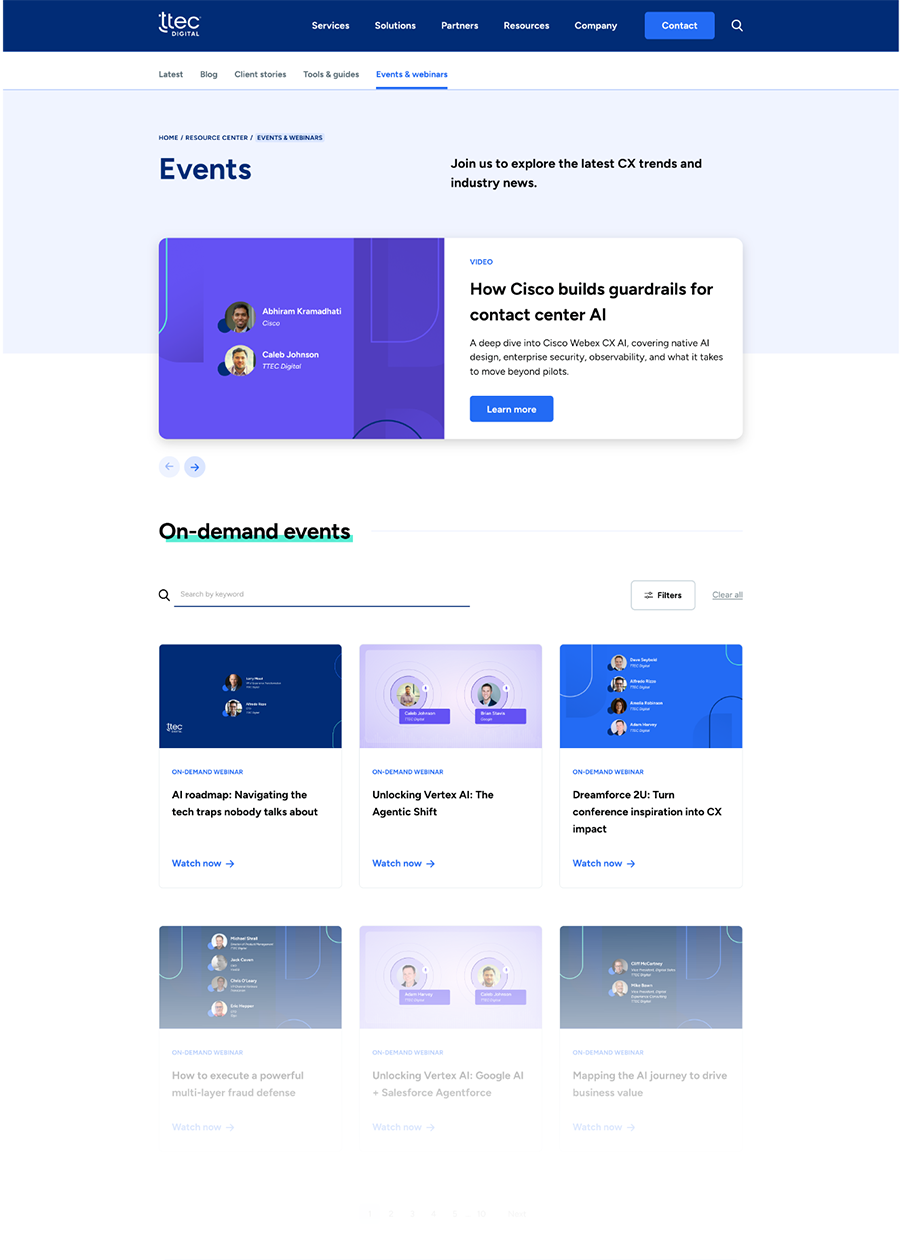
Above is the current Resource Center, surfacing the latest blogs, client stories, tools and guides, and events and webinars on the landing page, with dedicated secondary pages for each content type.
Early – Mid 2023
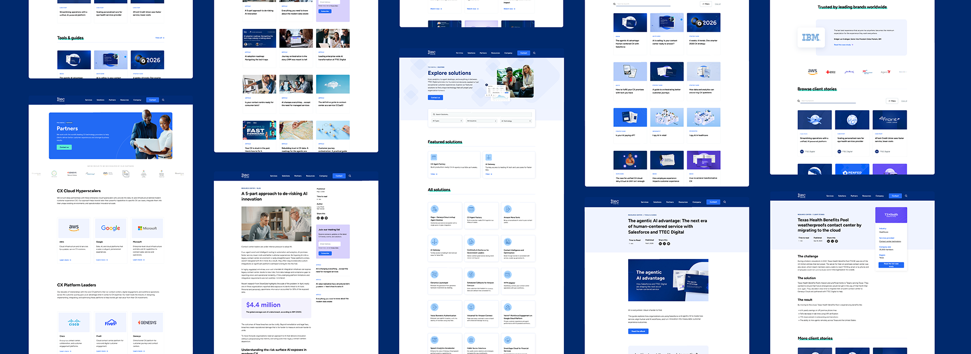
Interior pages —
Solution pages, blog templates, resource templates — every interior page got redesigned with the new brand in mind. The constraint was keeping the system simple enough not to overload the block library on the back end. The developers translated my Figma prototypes into our Craft instance, working within what Craft could do. The same structure later moved into Webflow, where the blocks became components fairly seamlessly.
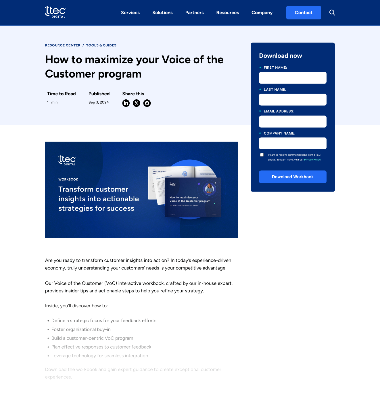
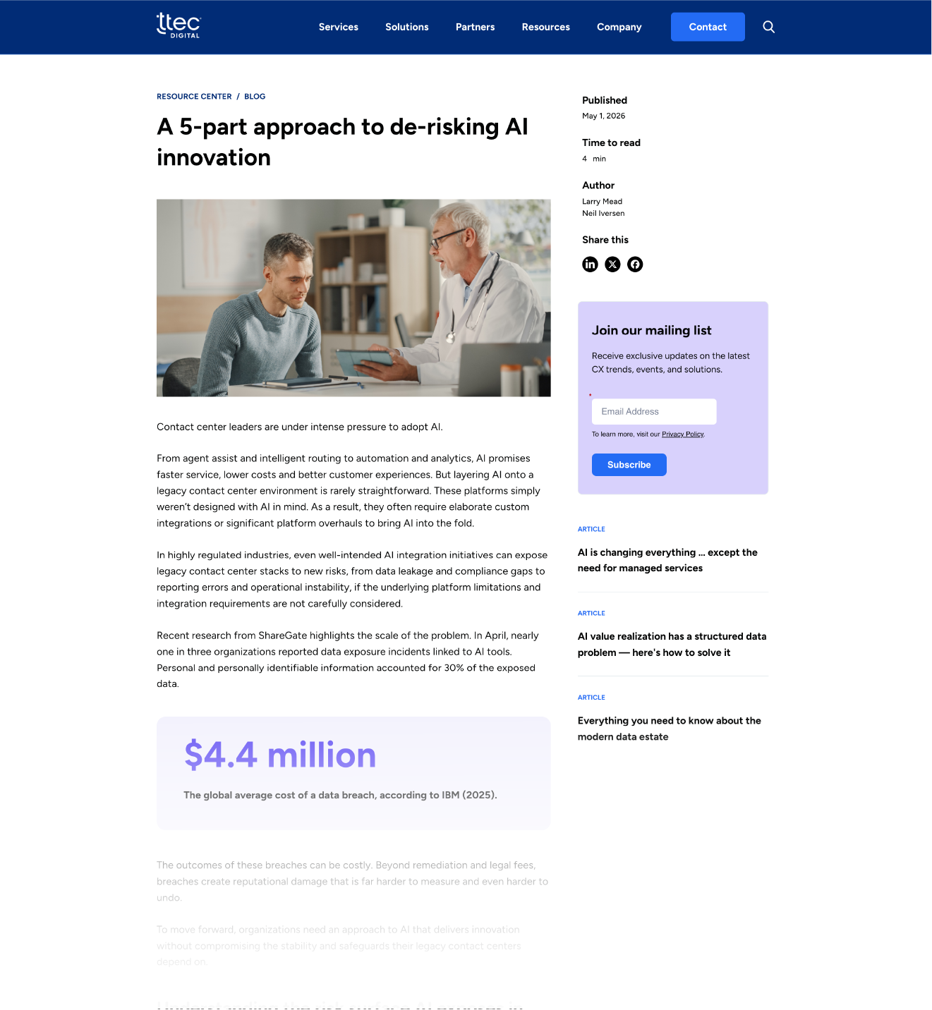
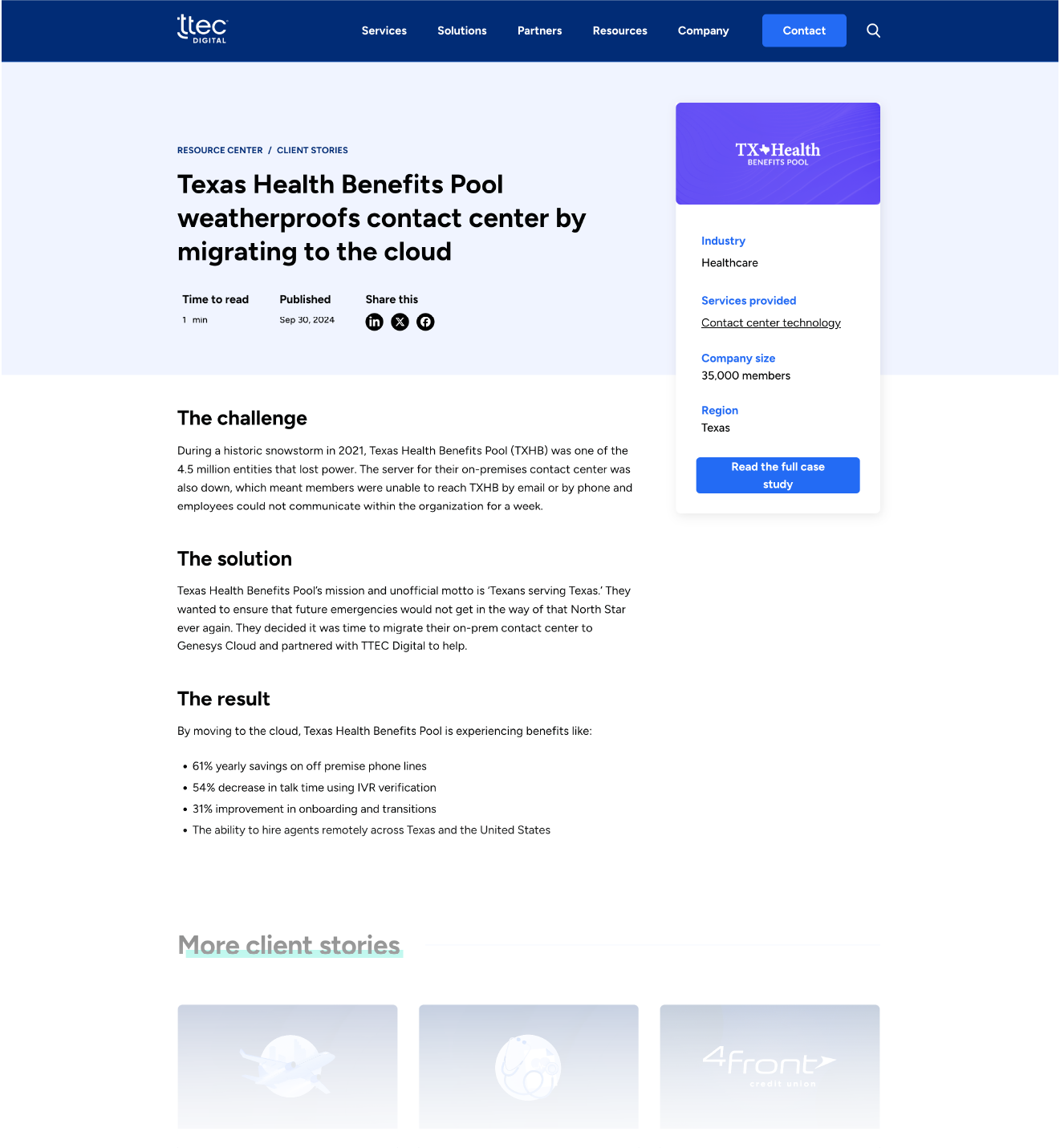
Interior pages redesigned around a 2/3 + 1/3 structure. The wider column held the main content. The narrower column held an optional form — visible at the top of the page when needed, removable when it wasn't. Consistency across pages mattered: users moving from one interior page to the next shouldn't have to relearn the layout each time.
Mid summer 2023
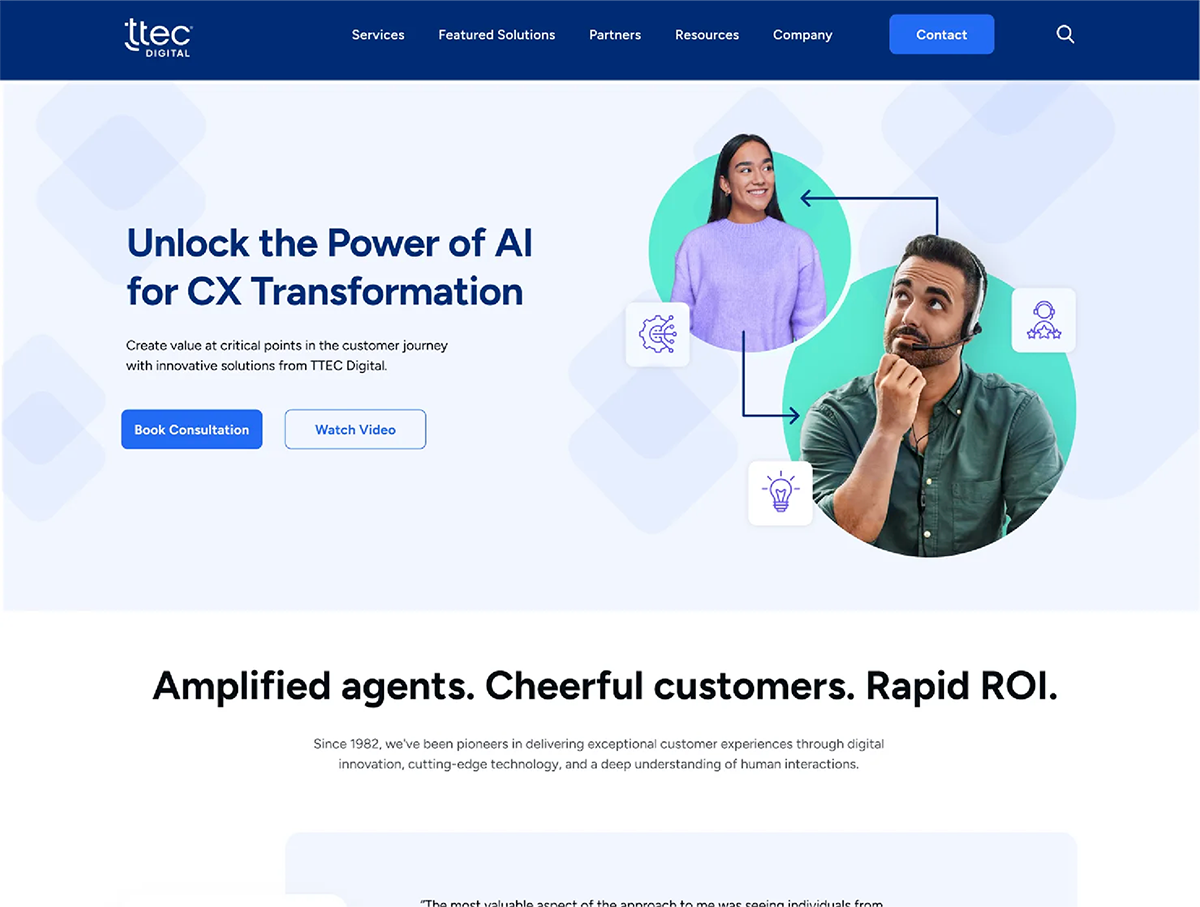
Refining the homepage —
The homepage is one of the main entry points into the site, so user experience had to come first. I redesigned it (after) with a few clear goals: a brand-forward look that finally felt like TTEC Digital, a hierarchy that made the value proposition land in seconds, and a layout that gave the user a path forward — whether that was booking a consultation, exploring the work, or seeing who else trusted the company. Even the white curve at the bottom of the hero was deliberate. A flat line cut the page off too quickly. The curve pulled the user's eye down and subtly encouraged them to keep scrolling.
Late 2024 – Early 2025
Moving to webflow —
By the end of 2024, the team wanted to keep pushing the site without waiting on a developer queue for every change. We reviewed platforms, sat through demos, and landed on Webflow.
An agency handled the migration from Craft. They did a 1:1 move but missed much of what the team needed to operate the site day-to-day. Our content strategist and I sat in hours of meetings, gathering assets and flagging gaps. When the migration handed off, the site was technically live but not ready. Content was thin, components weren't defined, collection lists were broken, static pages were unbuilt.
The cleanup landed on me and the content strategist. I built a defined component library, fixed the collection lists, finished the static pages, and set up class structures using Client-First conventions so the site could be maintained without spiraling.
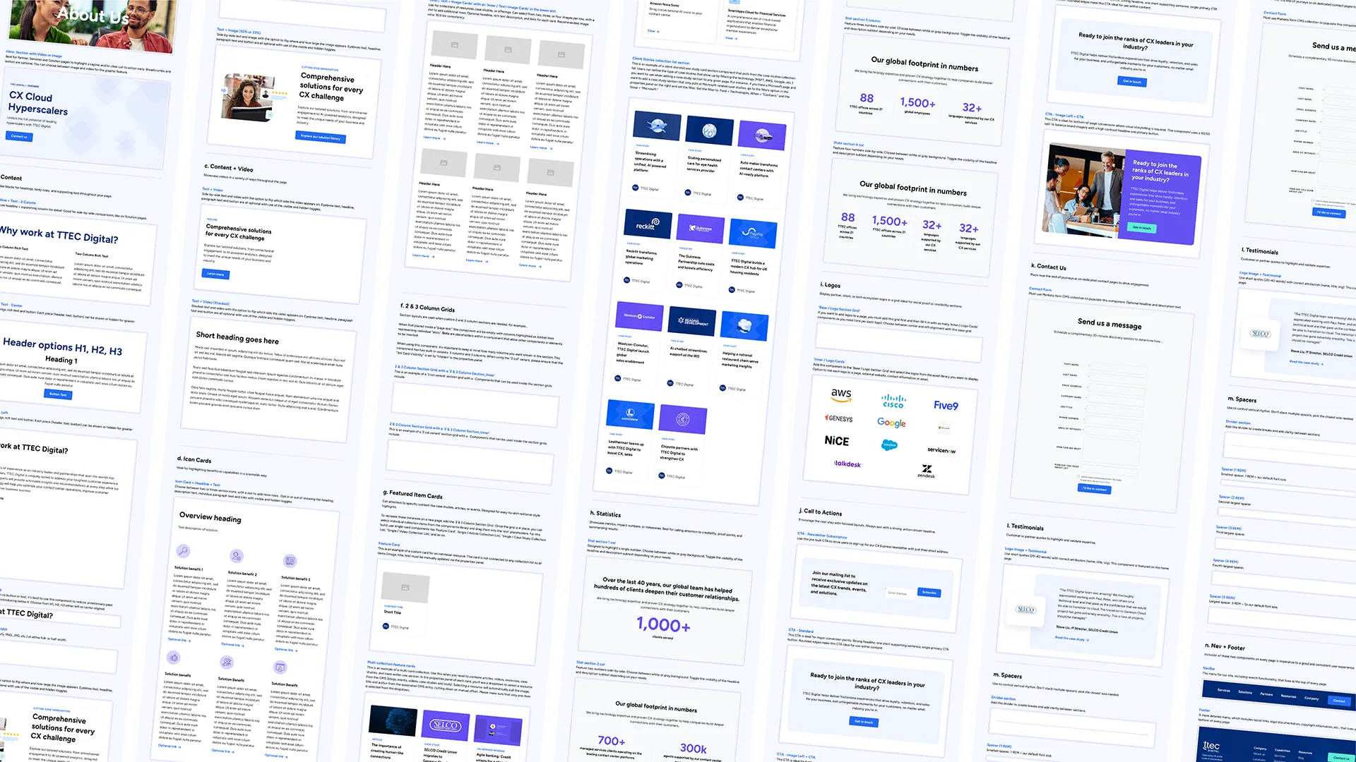
40+ components, cleaned up, and built to keep the site visually consistent and reusable for the whole team.
Ongoing
Where the site is now —
I'm still actively designing and building. New pages, new components, custom code, interactions — the site isn't a project with an end date.
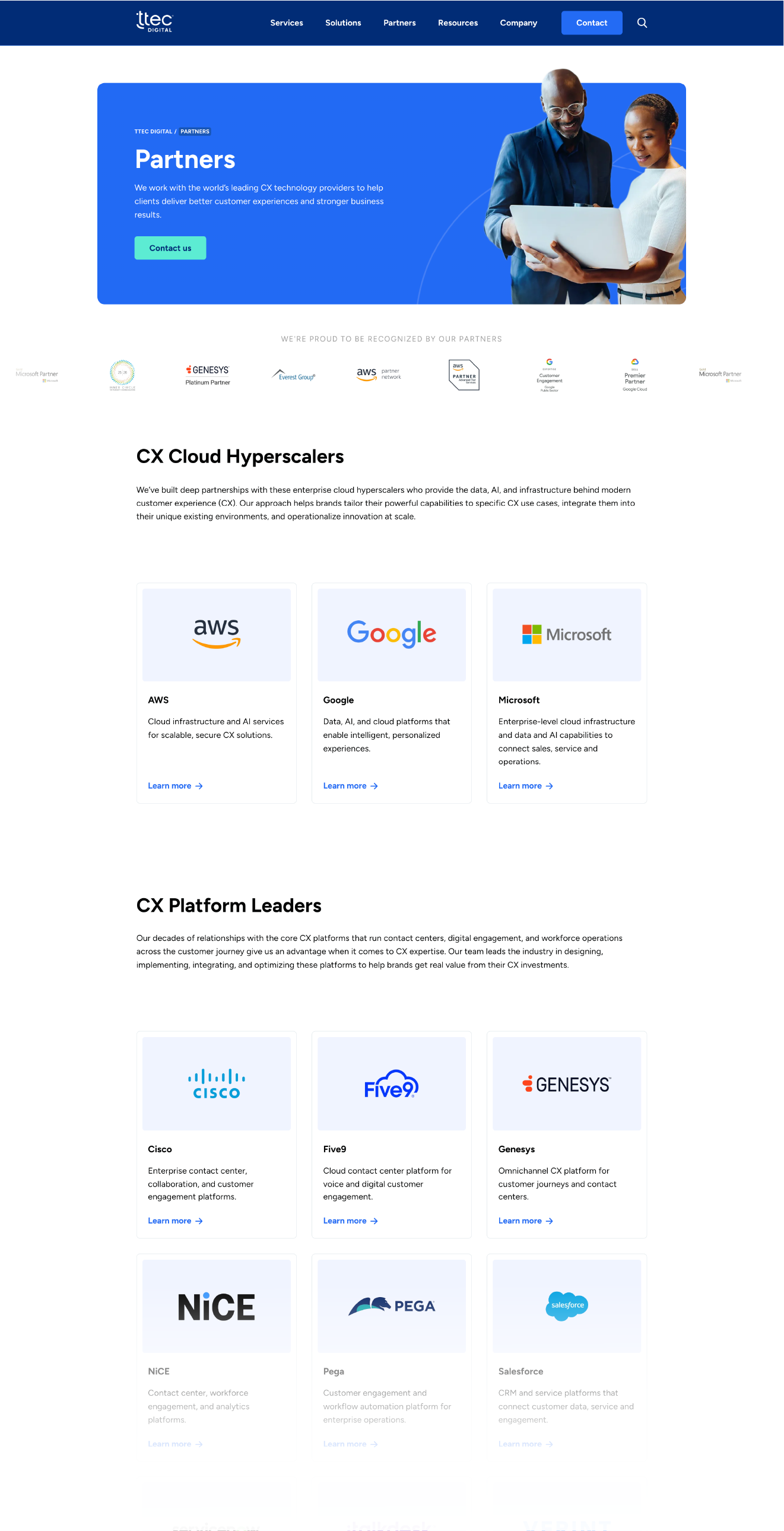
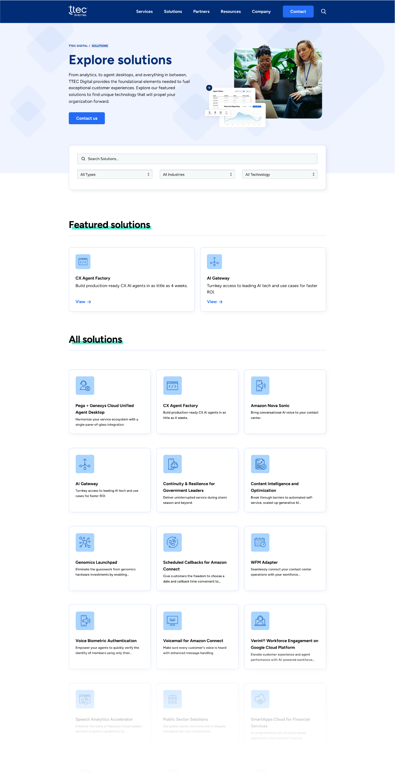
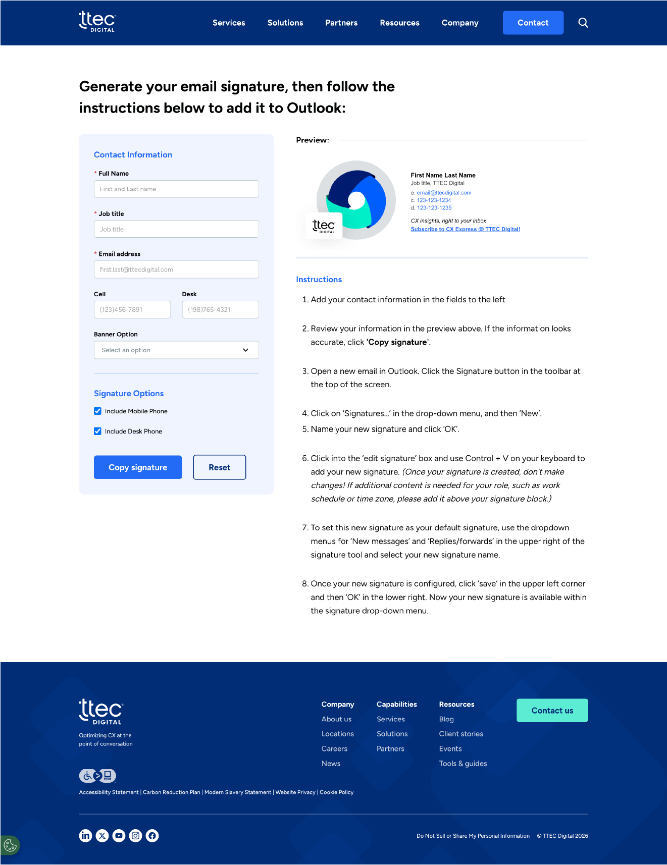
Now that pages ship quickly, I've designed and built a handful of new ones in 2026: an email signature generator using custom code, a redesigned partner page, and an updated solutions hub.